Horizon: Travel Planning App
Prototype · UX Design · Mobile App · TravelHorizon is an accessibility-first travel planning app prototype designed to help users organise trips with greater confidence. It supports itinerary building, venue discovery, and local-context planning while considering a wider range of accessibility needs from the start.
TL;DR
- Solo 12-week UX project at Birmingham City University
- Led the full design process from user research to a tested, WCAG 2.2-informed high-fidelity prototype
- Scored 90.2 (A+) on the System Usability Scale (SUS) across 5 usability sessions
Challenge
Accessibility is an afterthought in travel planning
Travellers of all kinds struggle to find reliable accessibility information when planning trips; information is scattered, inconsistent, and hard to verify. The challenge was to design a prototype that made accessibility central to the experience from the start, not an afterthought, while referencing WCAG 2.2 guidelines to inform design decisions throughout the process.
Process
Research-led, accessibility-first design
Discover
- Research into inclusive design, accessible travel challenges, and WCAG 2.2 guidelines
- Reviewed existing apps and new design solutions: large tap targets, consistent layout, and clear information architecture
Define
- Problem statement: "How might we design a travel app that makes trip planning inclusive and accessible for all users?"
- Core features identified: accessibility preference setting, itinerary planning, venue discovery with accessibility filters, and a boarding pass with key travel information consolidated in one place
Design
- Low-fidelity wireframes in Figma to test for clarity and task flow
- Built with an accessible colour palette, adjustable text sizes, and clear navigation hierarchy
- Prioritised key journeys: create trip, view plan, view local tips, and a translator
Deliver
- Accessibility reviewed against WCAG 2.2 Guidelines throughout
- Built a high-fidelity Figma prototype covering key user journeys such as creating a trip, reviewing daily plans, and managing accessibility preferences
Information Architecture
Structuring the app around user needs
The information architecture was defined early in the process to establish a clear hierarchy across the app - ensuring core features like trip planning, accessibility preferences, and daily itineraries were easy to find and logically grouped.
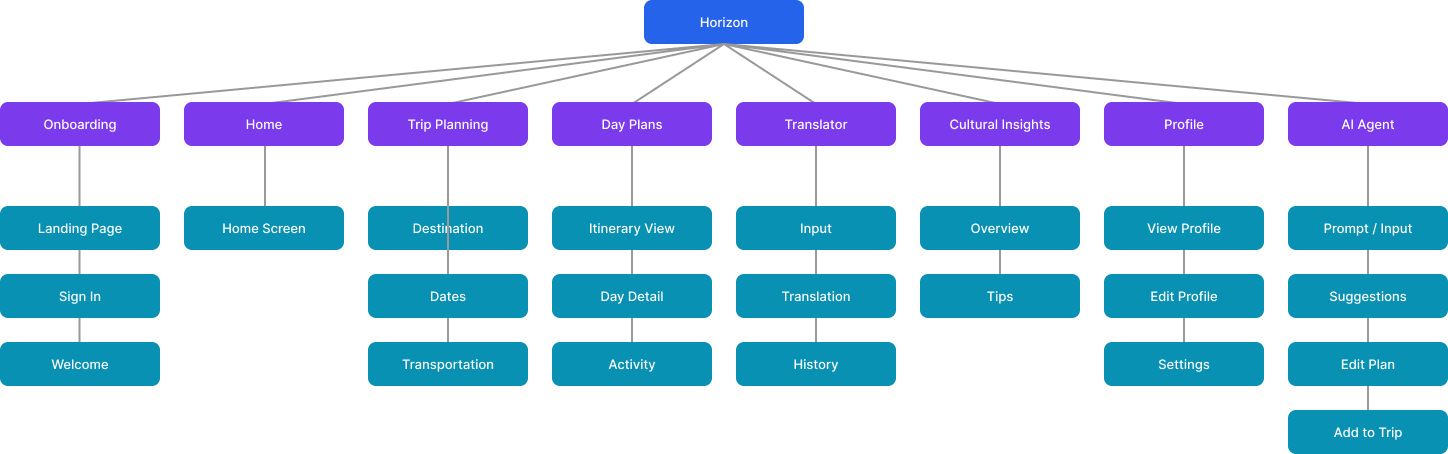
Click to view
User Flows
Mapping key journeys through the app
Key user flows were mapped to trace how people with different accessibility needs would navigate through the app - from setting up their profile and preferences to building and managing a trip itinerary.
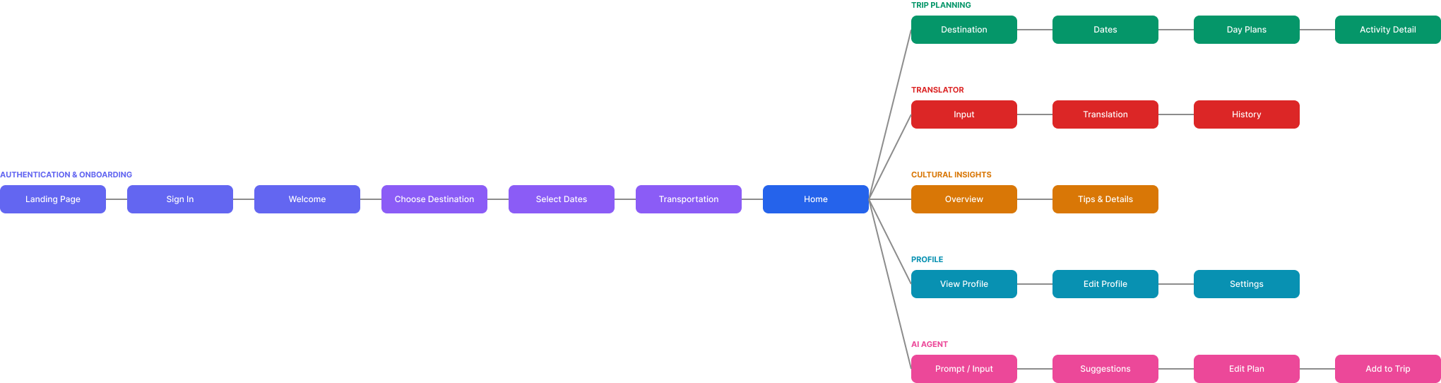
Click to view
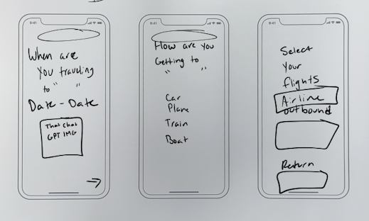
Sketches
Early ideation
Click to view
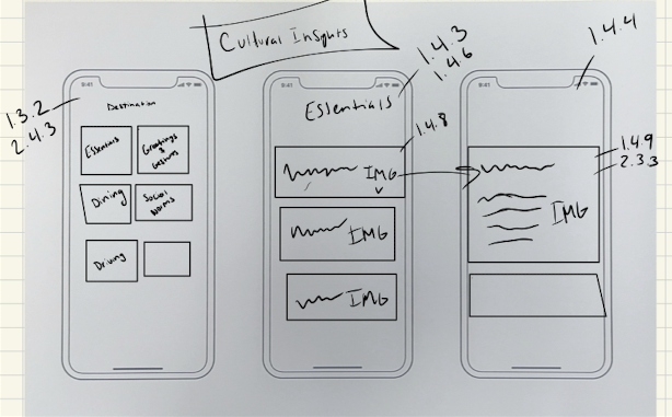
Click to view
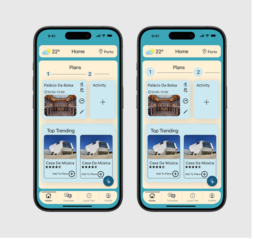
Prototype Walkthrough
Multiplatform Design
Designed to work across platforms
Horizon was designed with multi-platform accessibility in mind, ensuring the experience translates consistently across different devices and screen sizes.
Click to view
Click to view
Accessibility Decisions
Accessibility built into every decision
Horizon was designed with accessibility as a core constraint, not a finishing pass. Each decision below reflects a deliberate design choice, and where relevant, maps to a WCAG 2.2 success criterion that informed or validated it.
Inclusive Design for Physical Impairments
- WCAG 3.3.6: Error Prevention (All) - important actions require confirmation to prevent accidental errors
- WCAG 2.5.5: Target Size (Enhanced) - all tap targets are at least 44x44px for reliable interaction
- WCAG 3.3.8: Accessible Authentication (Minimum) - login does not rely on cognitive tests or complex input
Inclusive Design for Visual Impairments
- WCAG 1.4.1: Use of Color - no information conveyed by colour alone
- WCAG 1.4.4: Resize Text - text scales without loss of content
- WCAG 2.4.8: Location - users can always tell where they are in the app
- WCAG 1.4.9: Images of Text (No Exception) - text used instead of images of text
- WCAG 1.4.6: Contrast (Enhanced) - minimum 7:1 contrast ratio throughout
- Voice Input - hands-free search and navigation for users with motor or visual needs
Inclusive Design for Auditory Impairments
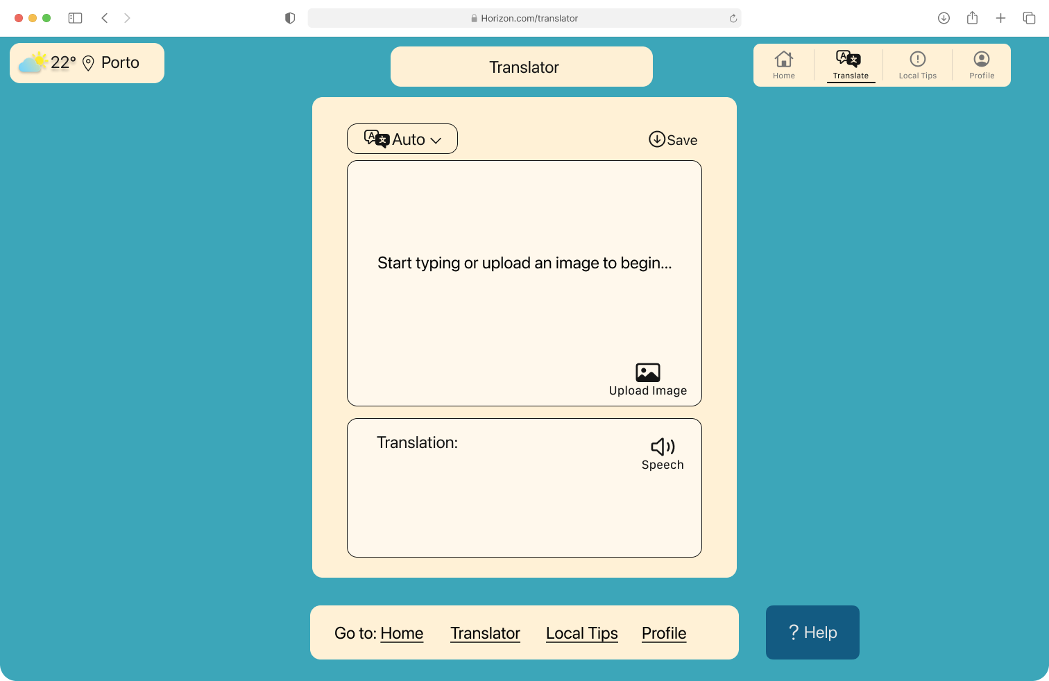
- Translator - in-app translation to support non-native speakers and reduce reliance on verbal communication
- Accessibility Filter - lets users filter venues by specific accessibility criteria relevant to their needs
- AI Trip Planner - suggests itineraries based on user-set accessibility preferences, reducing manual research
Inclusive Design for Cognitive Impairments
- WCAG 2.3.3: Animation from Interactions - motion can be reduced to avoid disorientation
- WCAG 2.4.2: Page Titled - every screen has a clear, descriptive title
- WCAG 2.4.6: Headings and Labels - headings describe content and labels describe inputs clearly
- WCAG 3.3.2: Labels or Instructions - form fields include visible labels and helper text
- WCAG 3.2.3: Consistent Navigation - navigation stays in the same place across all screens
- WCAG 3.2.6: Consistent Help - help options are always accessible from the same location
- WCAG 2.4.13: Focus Appearance - keyboard focus is clearly visible at all times
- WCAG 1.4.8: Visual Presentation - text spacing, line length, and contrast support comfortable reading
Multi-Platform Accessibility
- WCAG 2.4.13: Focus Appearance - visible focus indicator works consistently across platforms
- WCAG 1.3.2: Meaningful Sequence - content order makes sense when read linearly
- WCAG 2.4.5: Multiple Ways - users can reach any screen via more than one route
- WCAG 2.5.7: Dragging Movements - no functionality requires a drag gesture only
Testing
Validated across multiple rounds
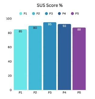
5 usability testing sessions were conducted to evaluate task clarity, navigation, and confidence when planning a trip. Participants completed the System Usability Scale (SUS), with individual scores of 85, 90, 95, 93, and 88, giving an average of 90.2. The lowest score of 85 was linked to visual inconsistency across screens, which was addressed through iterative refinement.
Key changes from testing
- Search bars increased to at least 44px height to meet WCAG touch target guidelines
- Numbers on the home screen made larger to improve readability, particularly for users with lower vision
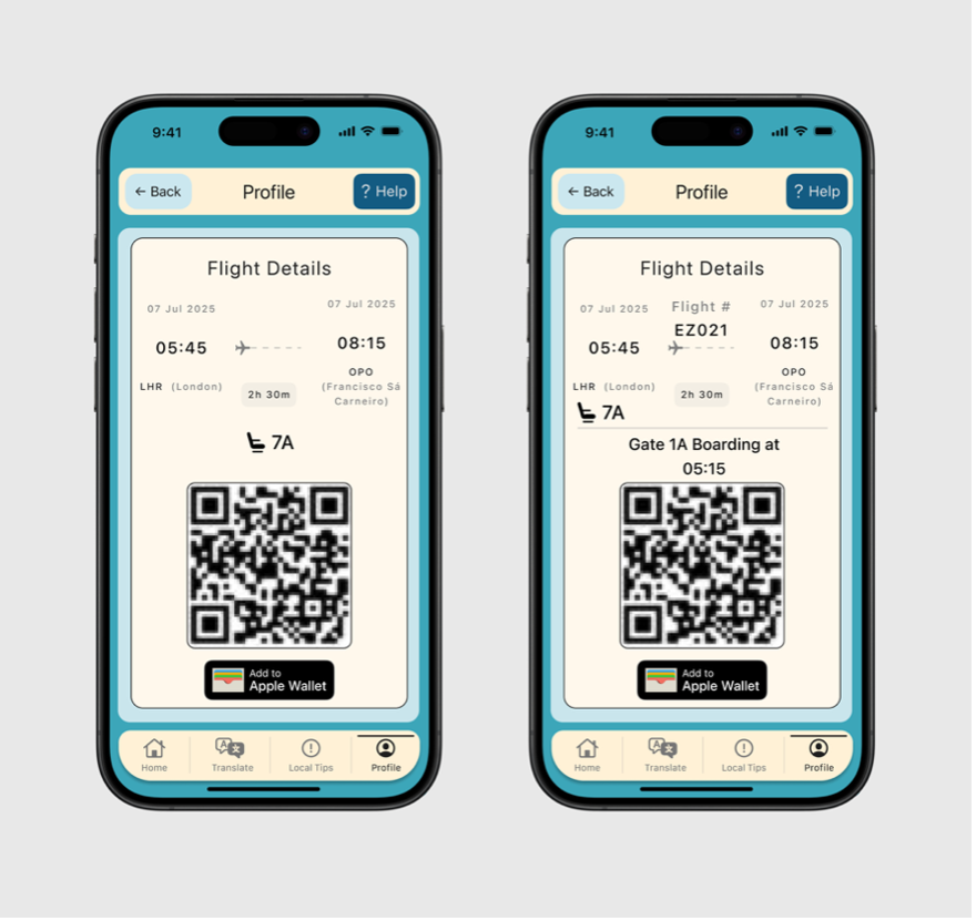
- Boarding pass updated to include gate and departure time so users have all key information in one place
- Settings icon given a text label after testing revealed an older user did not recognise the icon without a label
- Boarding pass added as a quick-access widget on the home screen
Click to view
Click to view
Click to view
Results
A prototype that puts accessibility first
- Delivered a high-fidelity travel planning prototype centred on accessibility-related needs
- Testing highlighted the value of structured daily plans and clearer accessibility information
- The project demonstrated how travel planning can better support confidence, preparation, and inclusivity when accessibility is considered early
Next Steps
What comes next
Horizon showed that accessibility and usability are complementary. The features that most supported users with specific needs, clearer labels, larger touch targets, structured itineraries, were consistently the features all participants valued. Designing for a wider range of needs made the experience better for everyone.
If taken further, the next priority would be research with participants who have specific accessibility needs, to test whether the accessibility features land as intended in real use. Validating the accessibility information layer against real venue data would also be a critical next step before any kind of live product.
Design System
Horizon visual design system
The tokens and components defined for the Horizon app, covering colour, typography, spacing, radius, effects, and stroke.
Colour - Brand
Brand Teal
#2BAAB8
Deep Navy
#1B3A5C
Orange
#F5A234
Colour - Secondary
Cream
#F5F0E8
Warm
#F0E5D0
Cool
#E8EFF5
Blue Light
#D0E8F5
Colour - Text & UI
Primary
#111111
Secondary
#555555
Tertiary
#888888
White
#FFFFFF
Light Grey
#F5F5F5
Border
#E0E0E0
Typography - Nunito
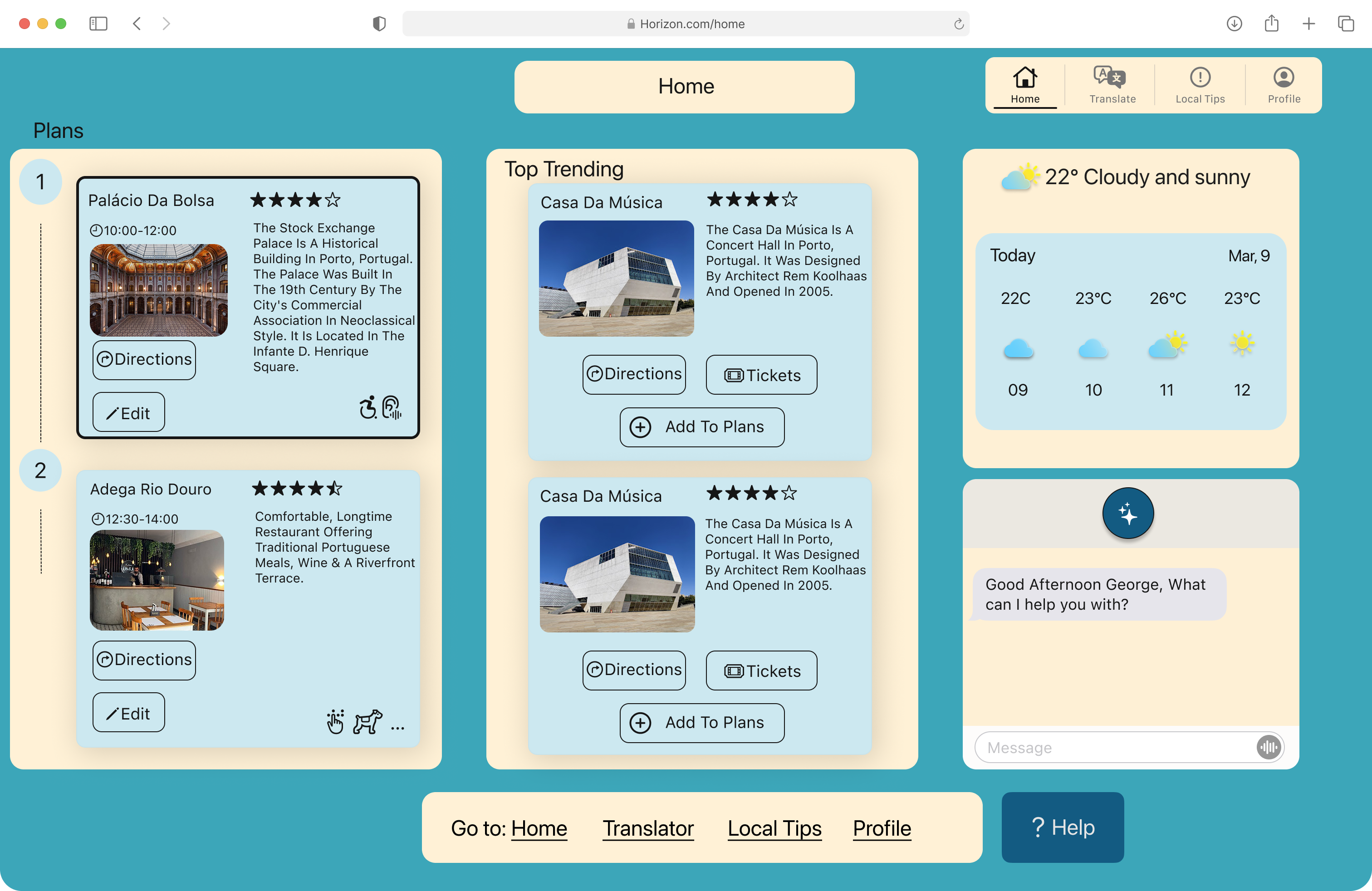
Where to next, George?
Palacio Da Bolsa
Day Plans, Porto
Top Trending This Week
Search for destinations, activities...
10:05, 12:30, Casa Da Ribeira, Porto
Home, Translate, Local Tips, Profile
Spacing
4
4px
8
8px
12
12px
16
16px
24
24px
32
32px
48
48px
Radius
XS
4px
SM
8px
MD
12px
LG
16px
XL
24px
Full
100px (pill)
Effects
Surface
0 1px 4px rgba(0,0,0,0.08)
Elevated
0 4px 12px rgba(0,0,0,0.12)
Drop
0 8px 24px rgba(0,0,0,0.18)
Stroke
Hairline
0.5px
Default
1px
Medium
2px
Bold
3px